 Several times I’ve encountered people discussing book covers on Facebook groups or on someone’s timeline. Each time I’m shocked to find people downplaying the importance of a great cover.
We readers are visual people and make assessments based on what we see.
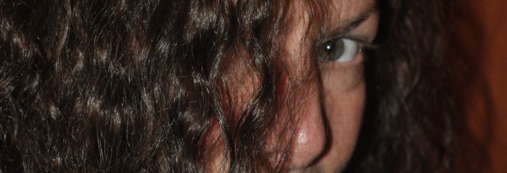
To the left is a cover that totally caught my attention the first time I saw it. She’s a new friend and reader of my novels. The cover is still a work in progress (she plans to make her name larger) but I thought it was an excellent example of the importance of really capturing the readers attention. Click the cover to check out Teresa’s website and information on her upcoming book release.
Another friend, who recently came to visit, made an excellent analogy. She is a foodie and wine connoisseur and she explained how she goes about selecting a new wine. She scans the labels until one peaks her interest and then she picks it up and reads about its contents. Sound familiar?
The cover really matters!
Another great example is websites. If I’m considering using a new vendor and they have an unappealing home page, I pass on them and move on. That’s their cover.
A few months ago I attended a conference about self-publishing. Several VERY successful (millionaire) indie authors (some traditionally published as well) and authors of The Naked Truth About Self-Publishing, stressed three things that are most important for success in our publishing endeavors:
- Write a great story and get it professionally edited.
- Write series because that keeps your fans coming back for more. AND
- Pay for a professional cover. They stressed this point!
My husband and I are currently reading through their book and we highly recommend it.
This topic is on my mind today because we’ve finalized the cover for a novel that my husband and I wrote together. I can’t speak for other authors, but for me, my covers are my most successful marketing tool. My covers elicit the reader’s interest, compelling them to read the blurb and potentially buy the book.
Please don’t let people convince you that the cover is not important and that you can just slap something together in word or Photoshop, because unless you are a visual artist, it will look like something you, the author, whipped up.
Here’s to elevating our craft to the highest level possible.
I would love to read your thoughts on my blog post.
Warm hugs,
Blakely
Please feel free to friend me on Facebook.
And like the My Body Trilogy Facebook page.
Find me Twitter & Pinterest.

Thank you for the compliment! I had 2-3 ideas for the cover in my head, but just to keep an open mind, I went to a major book store and looked through tons of covers to see what caught MY eye. I also asked random customers (hey, they are the one’s buying the books, right?) and store employees (they see what sells and what doesn’t), what they thought. I approached them and asked “What kind of cover do you see when I say ‘this title’?” I was surprised that many of the answers were similar. I got some awesome ideas. I still went with one of my original ideas but I knew it would work because it was along the same lines, visually, as many in the store suggested. I worked with an amazingly graphic artist through 99designs and was very pleased. I got lucky with elance.com and found an awesome content editor as well.
Regarding my choice in the cover. Many people I initially shared it with were confused that it was a man’s hand and not a woman’s, being its a memoir (my story). I wanted to illustrate that the pen (and words) can be instruments of both love and hate–life and death.. in that ‘the pen is mightier than the sword’/’words can be used as weapons’ kinda feel which is the reason I have the hand holding the pen like it could go either way in a split second and also why I have the ink drops going from hearts to daggers.
I must also give YOU kudos for great cover art. Your ‘my body’ series covers are HOT and steamy. They show the closeness and passion we long for and desire. They are warm and inviting, yet also give the flavor of ‘forbidden fruit’ that is so tempting and tantalizing. Awesome job!
Thank you so much for letting me use your cover on my blog and for your thoughtful comments. Research is incredibly valuable as you have shown. Thanks for the SO for my covers. I love them as well.
Warm hugs,
Blakely
I couldn’t agree more!
A good cover not only catches a readers eye, like you pointed out with your excellent example, but it should hint at what’s inside, what’s under that cover. It should compel you to reach for it.
I know you’re not supposed to judge a book by its cover, but it’s the cover that helps me decide if I’m going to look it over.
Not having a good cover does an author more harm than good.
Great post!
Thanks, Casey, for your comment. I couldn’t agree more.
Blakely